Archive for August, 2007

Apple, Security, Usability

Password Safe on the Mac

I’ve been using a Mac at work for a short while now and am much, much, much happier for it. As my coworker Mr. Ladwig says, I swear a lot less at the computer now. But there are a few Windows apps I’ve missed. Small things that aren’t quite worth firing up Parallels for, or that it wouldn’t make sense to anyway. TortoiseSVN is one, although I can work around that with the command line and Eclipse (and wait for Versions to be released). I miss TrueCrypt, which I used for anything that mattered, but FileVault and OS X encrypted disk images meet my needs, though I do look forward to an OS X version of TrueCrypt. If I had ever been more willing to dive deeply into the Windows world instead of just tolerating it, no doubt I would sorely miss PowerShell. But I don’t.

I can cope without all of that. What I really, truly miss is a good password manager. Namely Password Safe. With Password Safe, I never need to know any of my passwords. And I don’t. Password Safe can generate and store strong passwords and never display them to me. (Under the same principle, for some web sites I use a modded version of a password generator bookmarklet that you might find useful. It’s not perfect but for many things it’s good enough.) Passwords are stored in a believably cryptographically strong manner. After I copy a password to the clipboard to paste elsewhere, the password can be cleared from the clipboard by minimizing or closing Password Safe. Yes, keeping sensitive data in a shared clipboard makes me nervous. It minimizes and locks itself after a configurable period of time.

It works well and I trust it.

OS X has Keychain, a password store with strong crypto. It’s nicely integrated into the OS and made available to applications. Subversion finally uses Keychain to store passwords on OS X (instead of leaving them in cleartext, which you’ll find on Unix systems. Grrrr…). I can use Keychain to manage my passwords, but it badly needs some user interface work. Yes, it can generate passwords using several different algorithms, but I rarely succeed in creating a new password. There’s no clean way to copy the password to the clipboard, and when I do it visibly exposes the password in cleartext. Then I can’t clear it from the clipboard.

Keychain just needs a little UI love.

Last night on Twitter I was bemoaning the situation. Stephen Collins immediate responded, pointing out that there’s a Java version.

What? I didn’t see that in the list of related projects! Oh, that’s because it’s not there. It’s down under news from 16 January 2007. Of course.

But it’s there, and it works. Not surprisingly for something that’s at version 0.6, it’s not as polished as the native Win32 version. And maybe it needs a little Filthy Rich Clients love. But so far it’s a far sight better for what I want than Keychain is.

I should probably try Password Gorilla, too, which I’d conveniently overlooked. It reads and writes Password Safe 3 databases.

Thanks, @trib.

JavaScript

JavaScript DSL. It feels gooood.

For a while, we used Prototype at work. My choice. I was familiar with it from Ruby on Rails, script.aculo.us had effects I wanted to work with, and Dojo wasn’t quite ready yet (and was overkill for our needs). When Yahoo! released YUI, it did not take long for me to switch. Yahoo!’s attitude toward accessibility and toward graded browser support is much more in line with my philosophy. And by “in line with” I mean “identical.” Throw in thorough documentation and I’m sold. We still have discussions about framework choices, as the space changes a lot and different projects have different needs, but let’s save topic that for another day.

What I do miss from Prototype is the little bits of syntactic sugar sprinkled throughout. I could write this:

Event.observe('myLink', 'click', doSomething)

but it feels a whole lot more natural to write this:

$('myLink').observe('click', doSomething)

Instead of registering an event handler with some great EventHandlerManager in the sky, which is what the first bit of code feels like, I’m instead asking an object to observe itself and do something if an event happens. Technically that’s not necessarily what happens, but that’s what syntactic sugar is all about. I shouldn’t always have to care what really happens.

(I should confess here that I diverge from the mainstream in my funny ideas about object-oriented programming. I have been heavily influenced by David West’s Object Thinking, which hearkens back to OOP as it originally emerged, not as it was co-opted by procedural programmers who didn’t quite get it. I also readily accept that there are different ways of doing OOP “right.” Again, that’s a topic for another day.)

YUI doesn’t have any such nifty syntax.

YAHOO.Event.addListener('myLink', 'click', doSomething)

That’s what you’ve got. Okay, there are aliases:

YAHOO.Event.on('myLink', 'click', doSomething)

There are optional parameters let you easily pass an object as parameters to the callback, and redefine the scope of this inside that handler:

YAHOO.Event.addListener('myLink', 'click', doSomething, obj, override)

These are small touches that make a difference and that reinforce my pleasure in using YUI. But still, after a while the syntax feels stilted. Unnatural. Reading the code that I’m seeing turn up in some of our projects, including my own, I can see the code growing out of control. It’s easy to build up convoluted and verbose code that just does not make sense. It’s not YUI’s fault, but in the hands of someone who doesn’t understand the language, it’s not pretty.

Today, inspired by Adam McCrea’s JavaScript metaprogramming presentation, I took some code that was quickly becoming ugly and hard to follow, and turned it into a little domain specific language.

toggle(checkboxes).when('myLink').is('clicked')

I work with a bunch of people who hate JavaScript, mostly because they misunderstand it and dismiss it as a toy. Every time I write JavaScript, I’m delivering my coworkers code that not only will be used as a model, but that reflects on the language itself. If my code is inelegant, JavaScript looks bad. Worse than it deserves, anyway. :)

Today’s work feels good. Not only should it be really, really clear how to use the above code, all the code behind it is much more cleanly designed, and uses YUI to good advantage. It’s been a good day.


Personal

How Can You Tell?

A conversation between my wife and her mother:

K: Sam’s really excited about that.

Her mom: How can you tell?

Yeah, I deserve that. A poster boy introvert raised in Minnesota, I am usually… less than demonstrative. If you only ever talk with me about something I know well, you’ll see something quite different, but by and large I am quietly reserved.

Kiara jokes that I should wear a little badge on my chest so that people know when I’m upset:

Sam is upset

and when I’m happy, I could flip it over:

Sam is happy

I thought of this today when I was talking with someone about something that I think is really, really exciting, and I realized that I was giving practically no cues that inside, I was dancing like mad.

Gotta work on that.

Personal

Another scene from my life with Kiara

Me: Can we go see the Helvetica documentary?
K (without hesitation): No.
Me: Really?
K: Yes. I am here to thwart all your font-based film-going hopes.

Damn. I thought for sure she’d bite on that one, but I underestimated the strength and breadth of her life goals.

Design, Usability

No, they cannot print

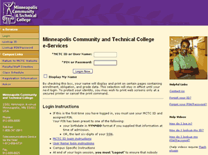
Over the past year at work, we’ve been moving our colleges to an updated version of our student and faculty online services “portal.” At first it’s just a look-and-feel update, letting colleges and universities provide their own style sheets so that instead of looking like this, a classic mid-90’s design:

old MnSCU e-services design
it can look like this:

MnSCU eservices site with MSCTC look & feel

or

MnSCU eservices site with MCTC look & feel

or

MnSCU eservices site with Saint Paul College look & feel

Considering that we released the base design and markup before I thought it was ready, some of the colleges have really outdone themselves in their designs. Bravo. But that’s not what this post is about.

While overhauling the markup, I wasn’t at liberty to remove things like the unbelievably verbose login instructions that you see in those screen shots. As useless as it is, that text is politically charged. College presidents have been involved in writing it. Seriously. We’ll be stripping it down before terribly long, but for the first release it had to stay.

I could, however, make changes like remove the “print this page” icon at the bottom of nearly every page.

Print this page icon

Two problems with it. First, all it did was call JavaScript’s window.print() function, with an unfortunate use of <a href=”javascript:window.print()”> that’s been bugging me for years. I’m trying very hard and with mixed success to make our use of JavaScript as unobtrusive as possible. If JavaScript is required to perform some functionality, then the JavaScript should inject itself into the page, layered onto the markup instead of tightly mangled into it.
Second, I asked around when I was visiting campuses and didn’t find anyone who used it. If they needed to print, they used File > Print or the print icon in their browser’s toolbar. I talked with a few campus webmasters, and they all had the same reaction: “uh, File > Print?” Since we don’t have a separate printable page (we use CSS to hide navigation and such) and since the print icon was apparently not used, I pulled it from the design.

I felt very comfortable with this decision.

Boy, was I wrong.

The new design was out in production for months before I heard any comments from campuses, but by then I had come to the realization that people don’t know how to print.

I figured, “hey, it’s exactly the same as every other application you use.” But here’s the thing: lots and lots of people don’t know about File > Print. Watch what people do in Word or Excel: they use the print icon in the toolbar. Internet Explorer has a print icon in the toolbar by default, and people use it — it’s even more noticeable in IE7. Take away the icon, and people don’t know how to print.

Okay, I thought, folks can just continue to do what they do to print every other page on the web and use the icon in IE’s toolbar. Those who use other browsers seem to manage just fine.

Then the complaints started rolling in. People just did not know how to print their schedules, their transcripts, their lists of advisees…

So yes, we’ll be adding a “print this page” icon back. It will be in a different place and won’t be the same image, and we’ll be using unobtrusive JavaScript, but we’ll be putting it back.

Live and learn.

Snobbery

On Scones

Let me just come right out and say that I’m a snob. When it comes to food, when it comes to drink, I prefer to enjoy the experience. Experience matters. Quality matters. That’s just the way it is.

So when I complain about what is being sold as scones here in the U.S., you understand. Yes, I’m bothered by the fact that they are nothing like their named counterparts in their native land, but mostly I am disturbed– deeply, deeply disturbed — by the simple fact that they are awful. Chalky, pasty, blueberry-cinnamon-encrusted crap.

There are of course exceptions. When I worked at the Roastery, we had a mother-daughter team baking us scones that were to die for. Traditional family recipe, everything you could hope for. That, my friends, that was a scone.

Brief pause while I pull myself back together. Whew.

Waiting in line at a coffee shop today, where they sell what can at best be generously described as a scone-like thing, the person behind me said the following:

I don’t really like scones in other coffee shops. They’re too dry. But these are better, they’re like a muffin but low-fat.

Sigh.

I don’t know where she got this idea. In whatever incarnation you might find them, scones are not low-fat. If they are labeled low-fat, they are unpalatable imposters.

But like I said. I’m a snob.