No, they cannot print
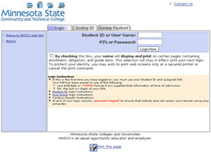
Over the past year at work, we’ve been moving our colleges to an updated version of our student and faculty online services “portal.” At first it’s just a look-and-feel update, letting colleges and universities provide their own style sheets so that instead of looking like this, a classic mid-90’s design:

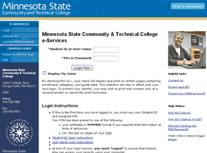
it can look like this:

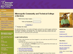
or

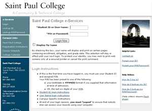
or

Considering that we released the base design and markup before I thought it was ready, some of the colleges have really outdone themselves in their designs. Bravo. But that’s not what this post is about.
While overhauling the markup, I wasn’t at liberty to remove things like the unbelievably verbose login instructions that you see in those screen shots. As useless as it is, that text is politically charged. College presidents have been involved in writing it. Seriously. We’ll be stripping it down before terribly long, but for the first release it had to stay.
I could, however, make changes like remove the “print this page” icon at the bottom of nearly every page.
![]()
Two problems with it. First, all it did was call JavaScript’s window.print() function, with an unfortunate use of <a href=”javascript:window.print()”> that’s been bugging me for years. I’m trying very hard and with mixed success to make our use of JavaScript as unobtrusive as possible. If JavaScript is required to perform some functionality, then the JavaScript should inject itself into the page, layered onto the markup instead of tightly mangled into it.
Second, I asked around when I was visiting campuses and didn’t find anyone who used it. If they needed to print, they used File > Print or the print icon in their browser’s toolbar. I talked with a few campus webmasters, and they all had the same reaction: “uh, File > Print?” Since we don’t have a separate printable page (we use CSS to hide navigation and such) and since the print icon was apparently not used, I pulled it from the design.
I felt very comfortable with this decision.
Boy, was I wrong.
The new design was out in production for months before I heard any comments from campuses, but by then I had come to the realization that people don’t know how to print.
I figured, “hey, it’s exactly the same as every other application you use.” But here’s the thing: lots and lots of people don’t know about File > Print. Watch what people do in Word or Excel: they use the print icon in the toolbar. Internet Explorer has a print icon in the toolbar by default, and people use it — it’s even more noticeable in IE7. Take away the icon, and people don’t know how to print.
Okay, I thought, folks can just continue to do what they do to print every other page on the web and use the icon in IE’s toolbar. Those who use other browsers seem to manage just fine.
Then the complaints started rolling in. People just did not know how to print their schedules, their transcripts, their lists of advisees…
So yes, we’ll be adding a “print this page” icon back. It will be in a different place and won’t be the same image, and we’ll be using unobtrusive JavaScript, but we’ll be putting it back.
Live and learn.
03 Aug 2007 Sam